I came across a very cool interactive 'Immigration Explorer' map that was created by the NY Times a few years ago. Here is what the interface looks like:
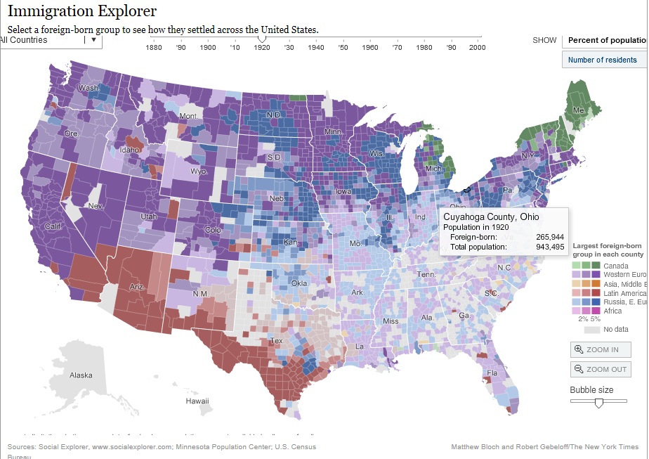
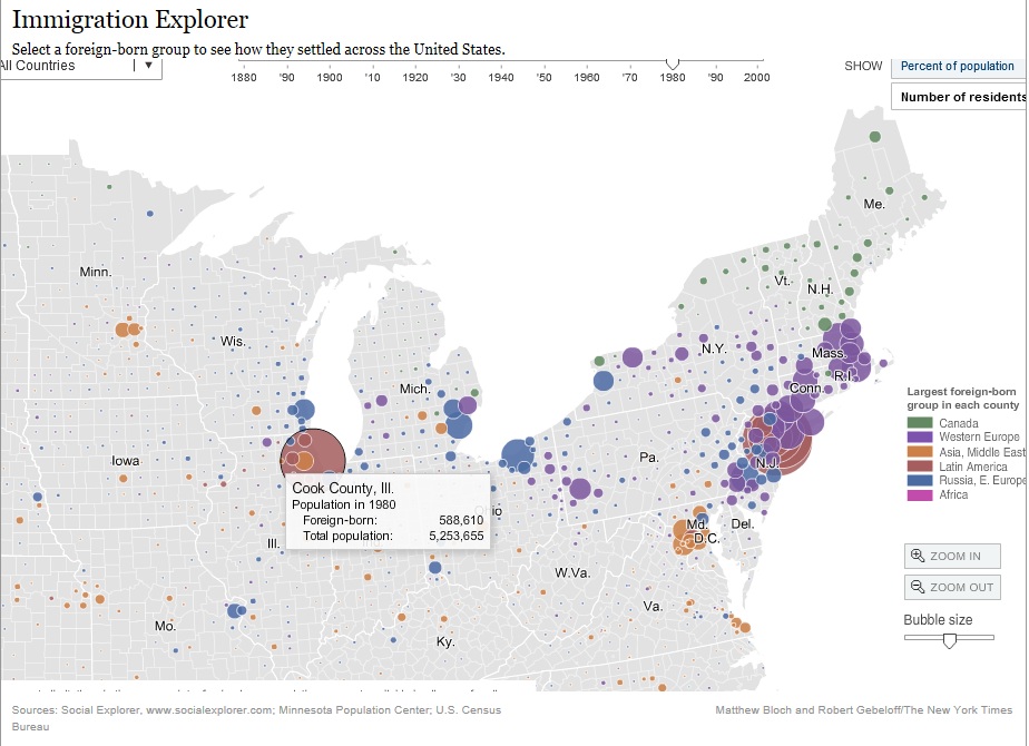
At the top of the map is a time bar on which you can move the little arrow to pick which decade's data you want to look at. This feature is really neat if you are interested in looking at how immigration trended geographically over time. Data is individualized by county, and if you hover over any county (for which there is data available), you can see foreign-born population as compared with total county population. Of course, the colors represent different geographical regions across the globe from which people emigrated. (Oh, and you can zoom in to a particular state or region in order to better see the counties.) If you click on "number of residents" in the upper-right corner, you get a different way to look at the data. The larger the circle, the more foreign-born residents live in that county at that time:
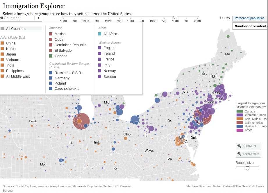
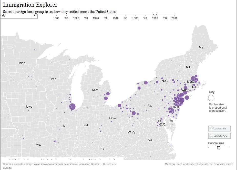
But what if you are interested in looking at immigrants from only one specific country? There is a way to do that, too. In the upper-left corner is an "All-Countries" pull-down menu. Click on any of the nations or regions listed, and the map will show only data for that nationality. For example, the second map below shows only data for Italy:
It's definitely a fun interactive map to play around with, especially if you are interested in geographic immigration trends over time. Check it out!
©2014, copyright Emily Kowalski Schroeder
©2014, copyright Emily Kowalski Schroeder